Against the grid was the overall theme for our senior design portfolio show. The show allows upcoming graduates to share their work with experienced designers for feedback and possible opportunities. I alongside four other designers part of this show participated to create the theme and branding. We were given 6 weeks to discuss, plan, and prepare. The five of us all were tasked with different aspects of the prep.
Type + Color + Final Poster
Final
Deliverable
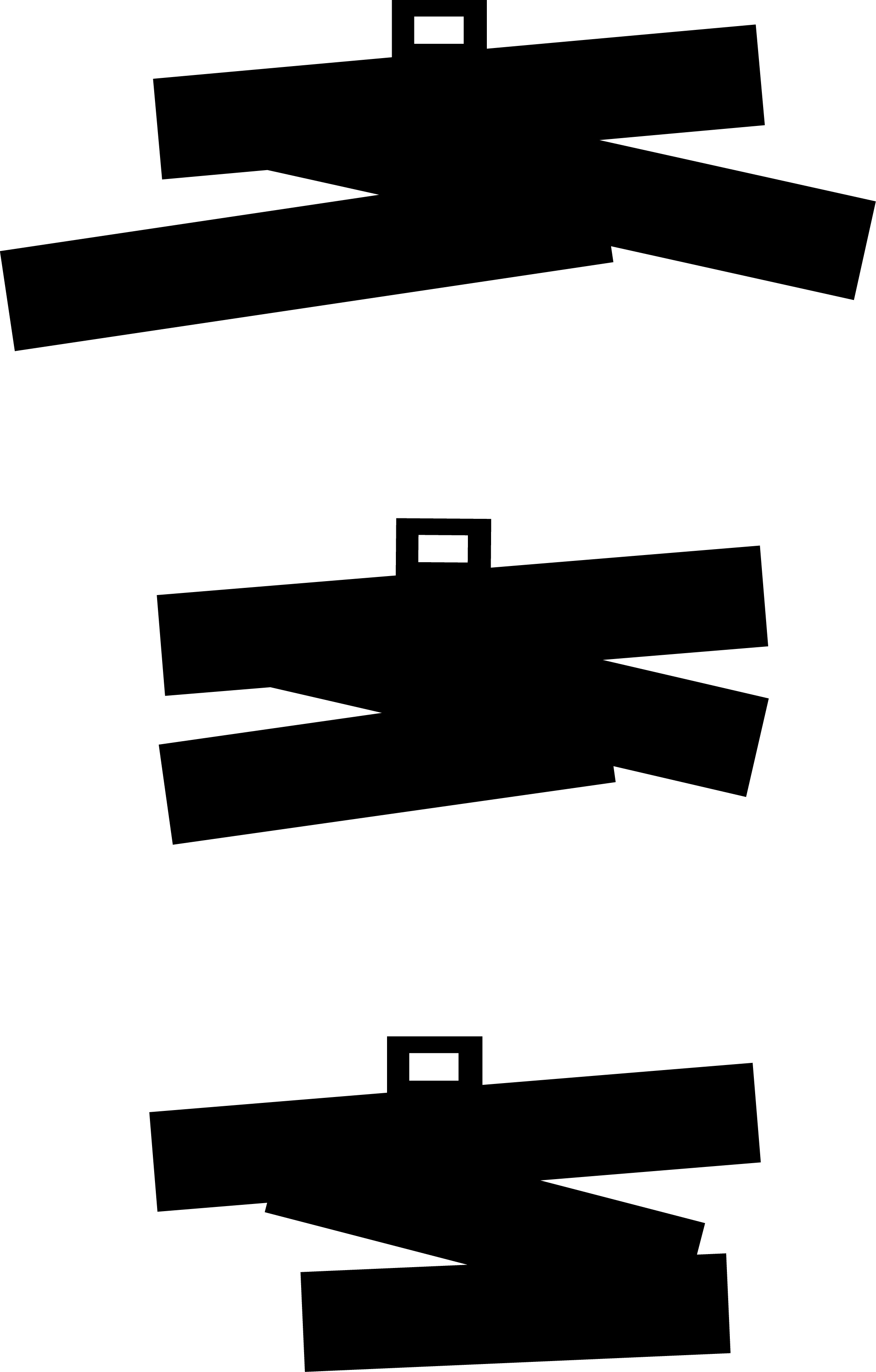
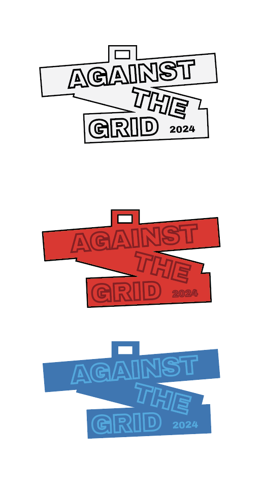
We had chosen stickers for our deliverables and wanted to explore how we can transfer the design of our poster to the sticker itself. I decided to look at the unique shapes used on the final poster and how that can be the template for our stickers. Trying three layouts it was agreed the design shouldn't stick out too long as it can rip and risk damage if removed. The title of our theme was also going to be used as our official title and so using the same font and adjusting the placement we agreed on the final layout of our type and shape.
Cutout options
Color options
Wayfinding
On the day of the portfolio show, a lot of first time visitors needed guidance once they arrived on campus. The last step in prepping for the show, and the role I was given, was to create the wayfinding that was effective and stayed within the theme. Taking that into consideration, I wanted to work a little bit with the environment these signs would be placed in. The university has a lot of white/ivory walls and so having a good contrast was important. Keeping the dark background, colors, and images from the poster I made sure they felt cohesive if placed side by side.


